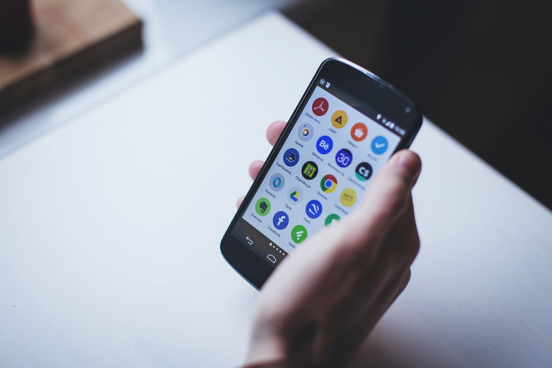
App icons. Every phone is filled with them.
If you’re contemplating getting your very own mobile app, you will have to create one that really stands out from the crowd. We put together a list of considerations to accomplish this.
The difference between icons & logos
Icons and logos are both are a powerful representation of your brand. However, there are some important distinctions to consider in order to create an app icon that works for your brand.
Logos are graphics, that state the name of a company, or product. They will can be made entirely of type, while others exist entirely as a symbol. Some combine text and graphics in the same design to convey their brand personality.
Think of logos as a much bigger representation of your business.

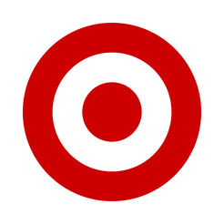
Target’s recognizable and distinct logo
Icons are an artistic summary of logos. While you can think of logos as the much bigger picture, icons are more of a snapshot.
Usually, icons are designed quadratically and scale within specific dimensions.

Target’s icon is a perfect summary of their logo
Logos don’t do well in icon designs. They look cluttered and squashed within their square confinements, which makes them hard to recognize.
You want your app icon to look clean and recognizable for your customers, so get creative! Find a way to make an icon from your logo.
Design your mobile app icon
Your icon is too small of a space to include very much, so use it wisely.
You will notice that some apps have initials or one letter that represents their brand name. You do not need to include nonessential words. Embrace simplicity. Your app’s name will show beneath the icon.
When choosing your colors, try to pick 2 of your brand’s colors that compliment each other. If not, choose a white or black to accompany your primary brand color.
![]()
Vogue’s app icon is classic, sleek, and minimalist.
Put your icon to the test
Your icon is going to show up in various places on customer devices. Attractiveness and legibility are a MUST. To keep these qualities across all sizes, you will have to make it scalable.
Settings and Notifications the app icons show up as small as 38×38. Scaling your icon to this size is a good test to see if your icon still is clear and recognizable.
Imagine standing far away from your logo. Can you still recognize what you see?
Follow specific dimension guidelines
iOS and Android do not have the same dimensions required of their app icons. Furthermore, they both have different sized devices that the icon must be optimized for.
It’s good to make a spec sheet of your icons for both.
iOS App Icon Standards
Here’s a list of the different sizes for the different Apple devices your icon will need to be optimized for. The first step is creating your app launcher icon.
| Device | Icon size |
| iPhone | 180px x 180px |
| 120px x 120px | |
| iPad Pro | 167px x 167px |
| iPad, iPad Mini | 152px x 152px |
| App Store | 1024px x 1024px |
You will also be required to make a set for Spotlight, Settings, and Notification icons.
iOS Spotlight Icon Size
| Device | Spotlight icon size |
| iPhone | 120px x 120px |
| 80px x 80px | |
| iPad Pro, iPad, iPad mini | 80px x 80px |
iOS Settings Icon Size
| Device | Settings icon size |
| iPhone | 87px x 87px |
| 58px x 58px | |
| iPad Pro, iPad, iPad mini | 58px x 58px |
iOS Notification Icon Size
| Device | Notification icon size |
| iPhone | 60px x 60px |
| 40px x 40px | |
| iPad Pro, iPad, iPad mini | 40px x 40px |
To learn more, read Apple’s app design guidelines.
Android App Icon Standards
All Android icons follow the same scaling rules. When creating your icon files, you must make five versions.
Standard Android App Icon Sizes
| Purpose | Size |
| App launcher icons | 48px x 48px |
| Action bar icons | 32px x 32px |
| Small/contextual icons | 16px x 16px |
| Notification Icons | 24px x 24px |
To learn more, read Android’s app design guidelines.
Android App Icon Shape
Your icons can be square or round for Android. However, we recommend choosing square so that your app can maintain consistency on both Android and Apple.
For Apple, you do not have to manually apply rounded corners on your icon. Submit a square icon. Their system applies a mask that rounds icon corners automatically.
Formatting Your App Icon
Both Android and iOS require the icon be saved in .png form. However, .png doesn’t always exactly provide a clear image. One way to bypass this is to create a vector image.
Vector images are scalable without losing quality. There are lots of free web applications that can help you vectorize your icon.
For Apple, you will have to convert your file into a PDF. For Android, you can import the SVG file.
The Takeaway
By following the design guidelines, applying the right formatting, and a little creativity, anyone create their own mobile app icon.
If the idea of doing this all yourself makes you nervous, no worries. You can always call for help.
In fact, if you develop your app with CommentSold, we can do the legwork for you.


